Continuing the cool diagram series, here's a sequence of drawings showing the scale of the Universe. You can navigate using the links next to the title.
x20 << 1 pixel = 250,000 km >> x50
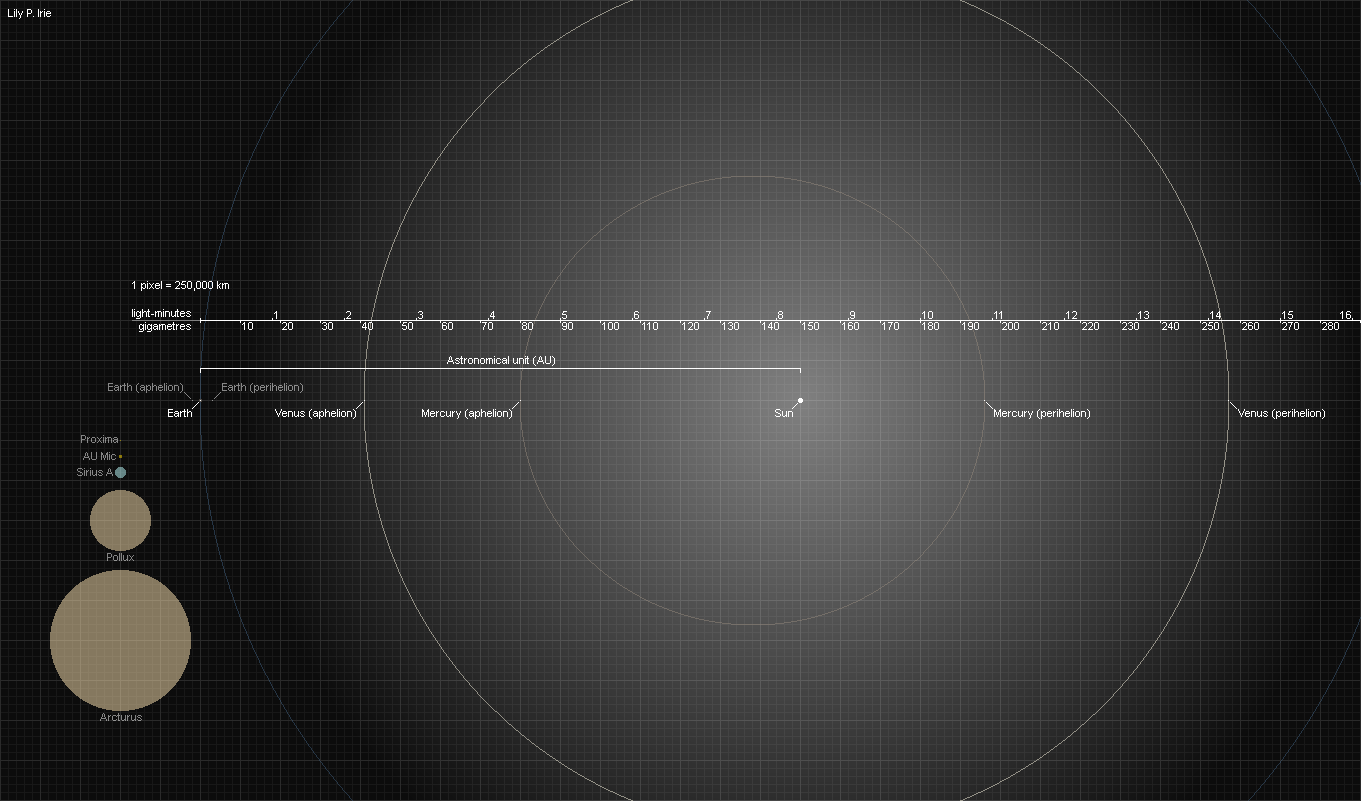
Zooming out another 20 times, even a pixel is now way too large to represent a planet like Earth (or even Jupiter), so the white dots now only denote the positions of planets. The actual Sun is now within view, the star itself a mere 5 pixels wide - but remember, that thing is just over 100 times as wide as Earth. The orbit of Luna is just barely visible as a ring of pixels hugging the dot in the middle of which Earth is.
The two new stars are the red giants Pollux and Arcturus. They have approximately the same mass as the Sun despite being tens of times wider; red giants are usually just dying sunlike stars, so they have about the same mass, if not less. Our own sun is expected to lose about half of its current mass as a red giant.
The planets obviously aren't in any of these positions at present, unless you're reading this at an incredibly lucky moment. Their orbits have also been perfectly aligned, when in reality they're offset and inclined all over the place.
The aphelion and perihelion are, respectively, the farthest and closest points to the Sun in a planet's orbit. Earth's distance from the Sun varies by a few million kilometres throughout the year, with the planet being at its closest to the Sun in January and at its farthest in July. This has a rather small effect on the seasons, which are mainly caused by the tilt of our planet's rotation, not by its proximity to the Sun.
Light takes about 20 minutes to travel the width of this image.